Three years, release by release
I joined Flink in 2021, mid-hypergrowth, and stayed through its consolidation into a business that had to earn every order. The work below isn't one project; it's the through-line of three years on the consumer app. I mapped the whole customer journey and picked my battles across it, from the first impression to the moment groceries land at the door.
- Awareness & onboardingHearing about Flink and the first impression of the app
- Pre-purchaseBrowsing the assortment, judging price, discovering deals
- During purchaseAdding to cart, unlocking bundles, checking out
- Post-purchaseTracking the order live, all the way to the door
Evolving the app UI
Rather than one big-bang redesign, I led a continuous overhaul of the mobile app: standardising typography, colours and iconography through the design system, and working closely with engineering to cut duplicate copy keys and translations across every screen. The result was a more consistent, faster-to-ship product that felt like one coherent app instead of a patchwork of releases.
Rolling out the Flink font
Flink had a custom brand font living only in marketing. To close the gap between the brand people saw and the product they used, I drove the alignment work to bring it into the app and web, validating it first with a preference test across Germany, France and the Netherlands. 66% of users preferred the Flink font over the incumbent Helvetica, calling it easier to read, friendlier and more distinctly Flink, and it rolled out across the product.
Brand colors, built into the design system
Alongside the font, we brought Flink's brand colours into the design system properly: extending each brand hue into an accessible shade range with contrast-checked design tokens, and keeping semantic colours, success, info, warning, error, clearly distinguishable from the brand palette so meaning never got lost in the pink.
Flink Prime, live in two markets
I led design for the launch of Flink Prime, Flink's subscription product, in Germany and the Netherlands: the concept, the rollout, and the constant balance between local nuance and one consistent product.
The affordability sprint
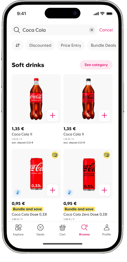
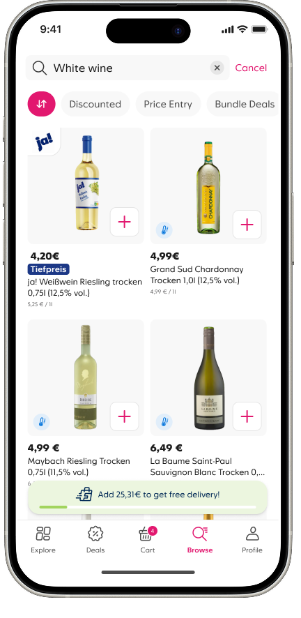
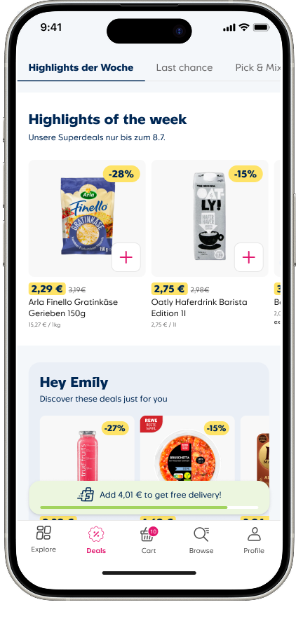
Perception of price was one of q-commerce's hardest problems: people assumed Flink cost more than the supermarket. I ran a design sprint targeting exactly that, sorting and filtering by deals and price point, clearer entry-price labelling, bundle deals surfaced on tiles and product pages, and a transparent free-delivery progress bar, so value for money was visible at every step of the journey.
Out-of-stock: a research-led problem
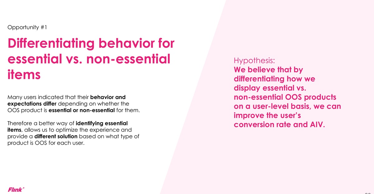
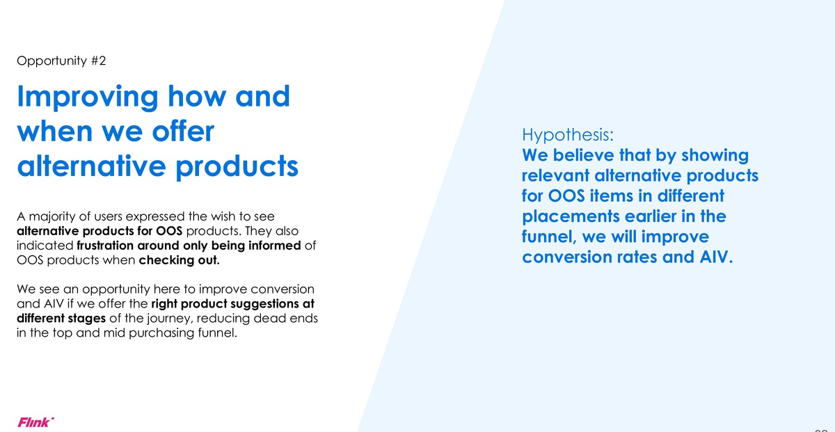
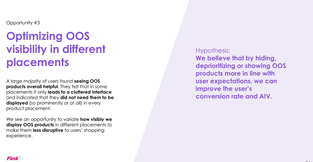
Running low on stock is baked into q-commerce, and it was quietly costing conversion: roughly 70% of daily users saw an out-of-stock product, and every 10-point rise in out-of-stock seen cost us around 3.5 points of conversion. We framed the problem, ran the survey and turned the findings into three clear avenues, differentiating essential from non-essential items, offering alternatives earlier in the journey, and rethinking where out-of-stock products should even appear. The shipped answer let people recover in place: swap the missing item, or remove it and keep going, instead of hitting a dead end.
Order Tracking 3.0 — my hands-on project
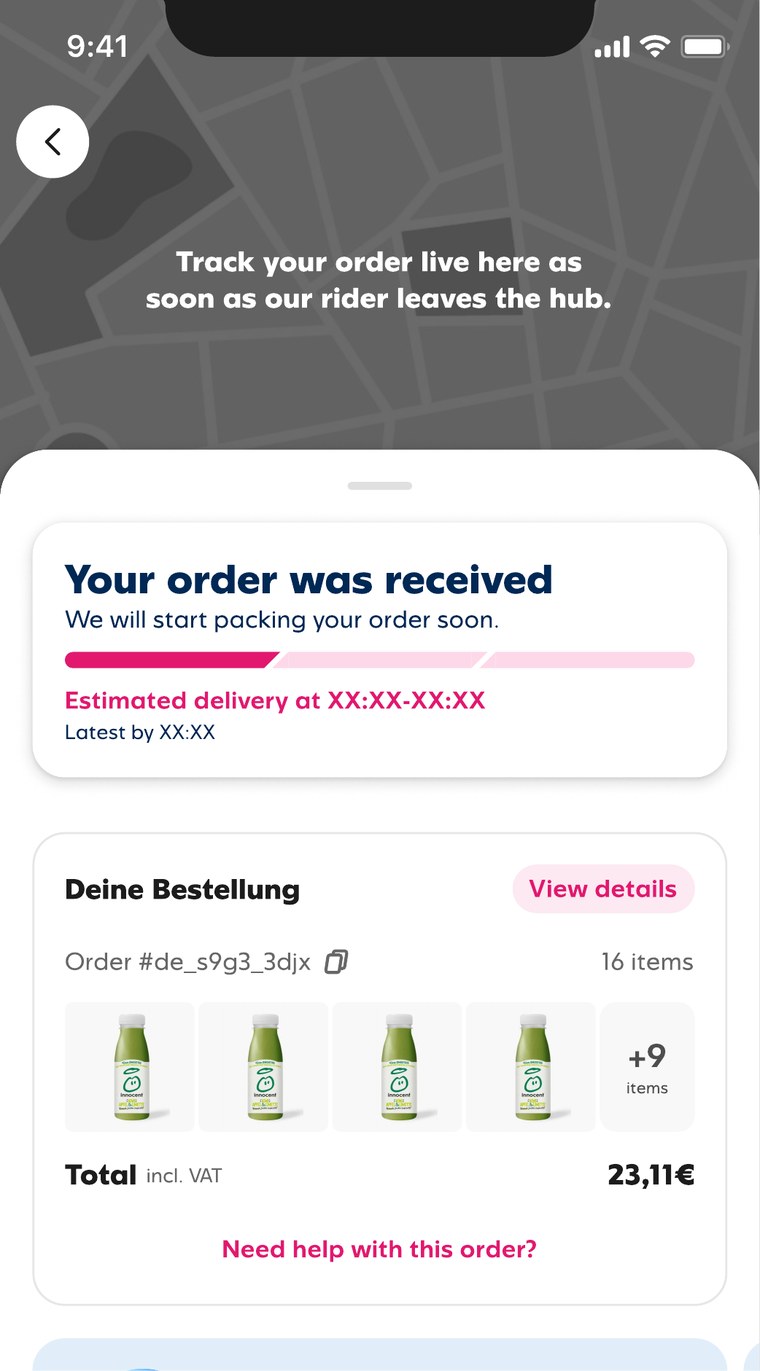
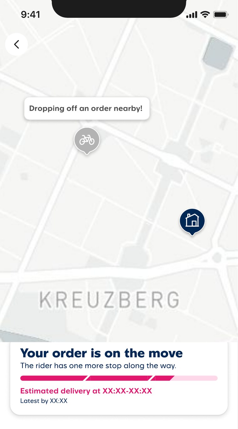
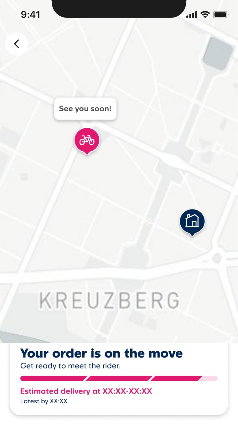
As design manager I usually oversaw the work; this one I designed myself, end to end. I turned order tracking from a static status line into a live map: a six-state journey from “order received” through packing, “one more stop along the way” and “see you soon”, each state with its own copy, progress bar and map behaviour. The tracking sheet pulls down to reveal the live map, the card sticks as a header while you scroll your order, and every state was specced down to the localisation keys, so what shipped matched what was designed. Watching your groceries actually arrive reads very differently to just being told they will.
Outcome
The UI overhaul left the app more consistent and faster to ship, and the Flink font shipped across the product with user preference validated before rollout. Flink Prime launched successfully in Germany and the Netherlands, and the redesigned order tracking and priority delivery experience shipped as part of the same push toward a faster, more transparent customer journey.